Effectively Center in CSS with Flexbox

A Positioning Case
When developing a site, the issue of centering the elements is omnipresent. Just on this blog article alone, many elements use precise positioning, without you even noticing it. The first one that comes to mind is the navigation bar, which displays different categories and icons, evenly distributed over the entire width (Or height, if you are on a mobile phone) of your screen. These elements are not simply glued together at the beginning or end of the line, but are positioned according to precise criteria to give them such a design.
If you are a web developer, you have probably already faced this problem. It must be said that between adjusting margins or creating a virtual table, several techniques can be used to approach such a result, at the cost of many complex parameters. Fortunately for us, those days are now over, and the emergence of the flexbox property will make our lives easier.
For the purposes of this article, I suggest that you take a fairly simple example, which can easily be adapted to any website. We will manipulate blocks of colors, and see how we can position them. Of course, these blocks symbolize the elements of your website, such as an image or text. I suggest you start with the following code, which should not cause you any particular problems.
<!DOCTYPE HTML>

<html>
    <head>
        <style>
            body {
                width : 600px;
                height : 900px;

                border : solid black;
            } [class*="container"] {
                width : 500px;
                height : 100px;

                margin-top : 50px;

                border : solid black;
            } .red-container {
                background : #FFDFDF;
            } .green-container {
                background : #DFFFDF;
            } .blue-container {
                background : #DFDFFF;
            } [class*="box"] {
                width : 100px;
                height : 100px;
            } .red-box {
                background : #FF3F3F;
            } .green-box {
                background : #3FFF3F;
            } .blue-box {
                background : #3F3FFF;
            }
        </style>
    </head>
    <body>
        <div class="red-container">
            <div class="red-box">
        </div>
        <div class="green-container">
            <div class="green-box">
        </div>
        <div class="blue-container">
            <div class="blue-box">
        </div>
    </body>
</html>
We have three containers, each containing one box. Our goal will be to center these boxes in the containers, and to manage their behavior towards each other. Note that I added a margin, borders, and a background color, to better visualize the elements, but this is totally optional.
Define an Axis
Time for action ! Before using the flexbox property, it is important to understand how it works. Its role is to modify the positioning of the child elements, in order to space them properly from each other. As a result, flexbox does not apply directly to blocks, but to their containers, the red-container, green-container and blue-container classes.
To transform them, it is necessary to modify the display property, and assign it the flex value.
[class*="container"] {
    display : flex;
}
There you go ! You have successfully created your first flexbox element. But to use it to its full potential, it will be necessary to define its axis. Depending on the design of your site, you will need your components to be placed in line (One after the other) or in a column. (One below the other) To do this, we will use the flex-direction property, and assign it the value row or column.
.red-container {
    flex-direction : row;
} .green-container {
    flex-direction : column;
}
Note that I have not defined anything for blue-container. It should be noted that the default value for flex-direction is row, which means that red-container and blue-container will have a horizontal axis, while green-container will use a vertical axis.
Now that your axis is defined, it is time to place the different elements on it.
Let's Center
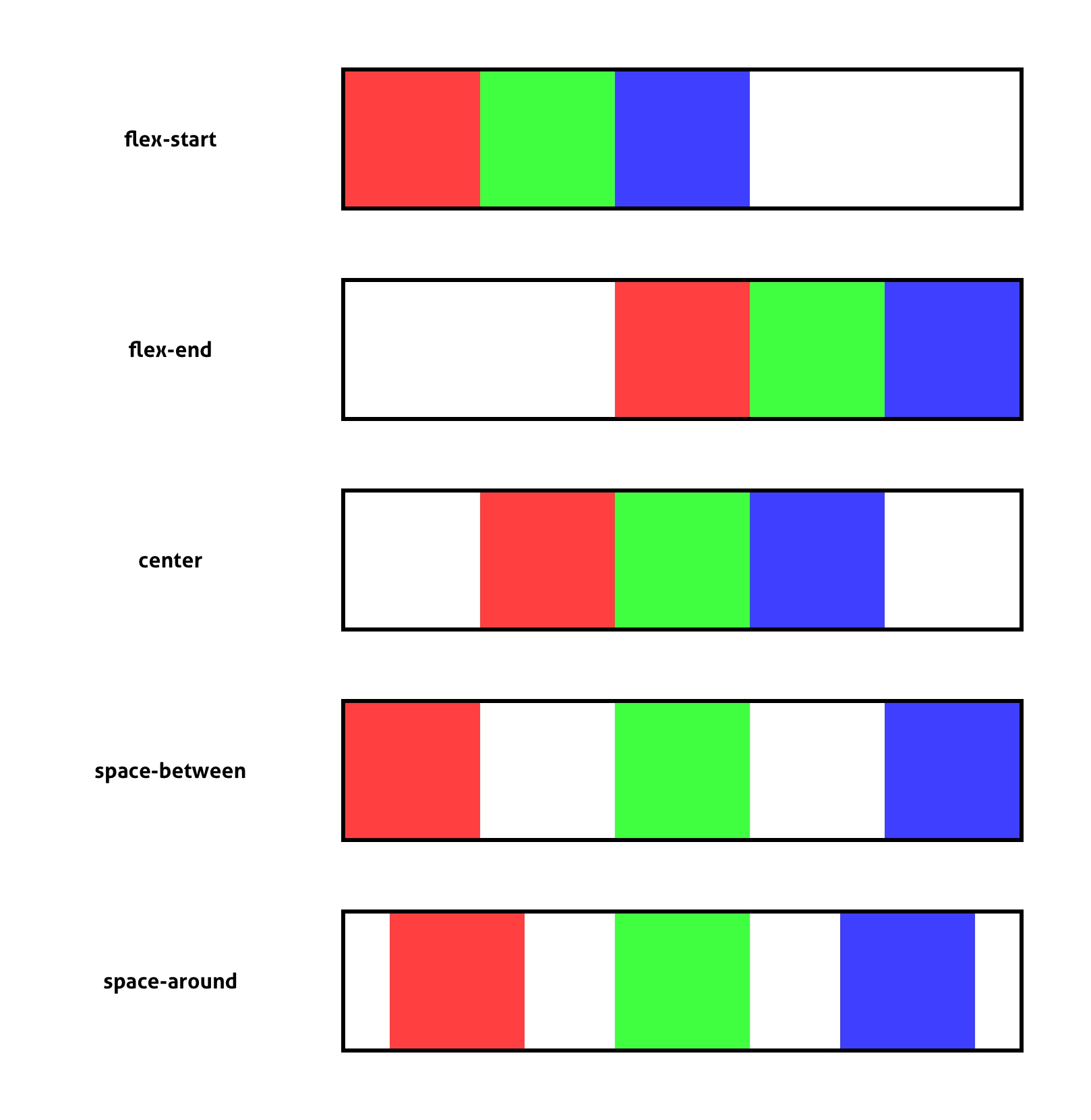
By default, your components will be placed successively on your axis. Except that if you read this article, it is not to be content with the default positioning. The secret of flexbox lies in the justify-content property, which will change the way the elements are positioned on the axis. The different possible values are as follows :
• flex-start : The elements will move from left to right (Or from top to bottom, if your axis is vertical) and will follow each other one after the other. If the entire width of the container is not occupied, you will have an empty space on the right. (Or below) This is the default value, which is quite close to what you would get without flexbox.
• flex-end : Similar to flex-start, except that your elements will be positioned from the end of the axis. If the full width is not used, you will have an empty space on the left. (Or above)
• center : It's starting to get interesting. With this value, your elements will be grouped in the center of your axis, and the margins automatically adjusted accordingly.
• space-between : The elements are equally distributed on the axis, so that each of them is as far away from the others as possible.
• space-around : Similar to the operation of space-between, except that the elements at the ends are separated from the edges of the container.
As an image is worth a thousand words, I suggest you see the behavior of each of these values. To achieve this, I simply added two additional blocks to each container.
Now that you have understood how to use justify-content, I have an important element to introduce you to. If you have defined your flexbox on a horizontal axis, (Row) your elements are centered horizontally. But it would be interesting to be able to center them also on the secondary axis, the vertical axis. To do this, we use the align-items property, which takes as its value flex-start, flex-end, center, or stretch. The first three values have the same function as the justify-content property. The only new feature is the stretch, which allows each element to be stretched so that it takes the full height (Or width) available.
body {
    align-items : stretch;
}
Note that, if you define flex-direction to row, the main axis (The one used by justify-content) will be horizontal, and the secondary axis (The one used by align-items) will be vertical. If you assign column to flex-direction, the main axis and the secondary axis will be reversed.
Finally, there is a small technique if you need to center both the main and secondary axis. All you have to do is apply automatic margins, instead of the behavior of each axis. The result will be the same, with an even simpler code.
body {
    display : flex;
    margin : auto;
}
Manage Overflow
Finally, I would like to touch on an important element, which is the overflow of your content. Each component on your axis will take up a certain amount of space. At some point, your axis will be complete, and it will not be able to contain any other elements. In this case, you must specify the behavior to adopt for the next blocks, through the flex-wrap property. Here are the values it can take :
• nowrap : The elements will be systematically reduced, and will always fit on a single line. This is the default value.
• wrap : The next items will be sent to the line, as when you write text.
This is a detail, but this property can help you prevent a block that is too large from appearing in the wrong place on your site.
<!DOCTYPE HTML>

<html>
    <head>
        <style>
            body {
                display : flex;
                flex-direction : column;
                justify-content : space-around;
                align-items : center;

                width : 600px;
                height : 900px;

                border : solid black;
            } [class*="container"] {
                display : flex;

                width : 500px;
                height : 100px;

                border : solid black;
            } .red-container {
                justify-content : flex-start;

                background : #FFDFDF;
            } .green-container {
                justify-content : flex-end;

                background : #DFFFDF;
            } .blue-container {
                justify-content : center;

                background : #DFDFFF;
            } .yellow-container {
                justify-content : space-between;

                background : #FFFFDF;
            } .magenta-container {
                justify-content : space-around;

                background : #FFDFFF;
            } [class*="box"] {
                width : 100px;
                height : 100px;
            } .red-box {
                background : #FF3F3F;
            } .green-box {
                background : #3FFF3F;
            } .blue-box {
                background : #3F3FFF;
            }
        </style>
    </head>
    <body>
        <div class="red-container">
            <div class="red-box">
            <div class="green-box">
            <div class="blue-box">
        </div>
        <div class="green-container">
            <div class="red-box">
            <div class="green-box">
            <div class="blue-box">
        </div>
        <div class="blue-container">
            <div class="red-box">
            <div class="green-box">
            <div class="blue-box">
        </div>
        <div class="yellow-container">
            <div class="red-box">
            <div class="green-box">
            <div class="blue-box">
        </div>
        <div class="magenta-container">
            <div class="red-box">
            <div class="green-box">
            <div class="blue-box">
        </div>
    </body>
</html>
As a developer, you are now able to perfectly center elements in their containers in a few lines of code. Flexbox may be a recent property, but its ease of use allows it to be used every day by many developers like you. I invite you to test it on your next projects, and you will see that you will not be able to do without it !
Écrit par Pythony le 08/12/2019.